The core of a great cardboard display stand
By Shenzhen Topwon Group Co.,Ltd
Oct 21, 2024
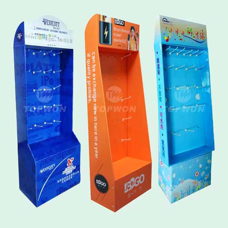
The role of cardboard display racks is not only to store goods, but also has a certain promotional attraction. Therefore, a good cardboard display rack, graphic design in line with aesthetic principles, concise and clear advertising language, can resonate with consumers.
Smart display props and what necessary elements should have?
- Convenient operation
- Smooth operation
- Support diversified interactive experience
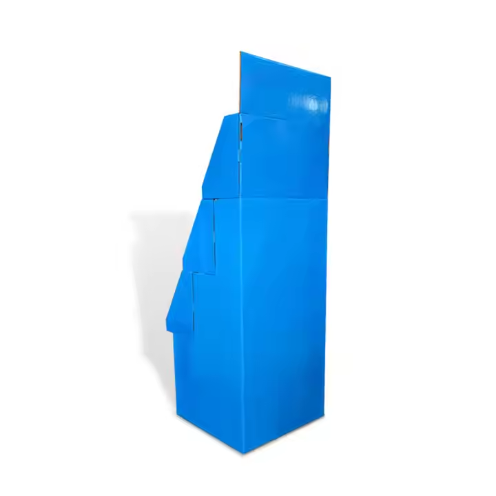
Cardboard display stand
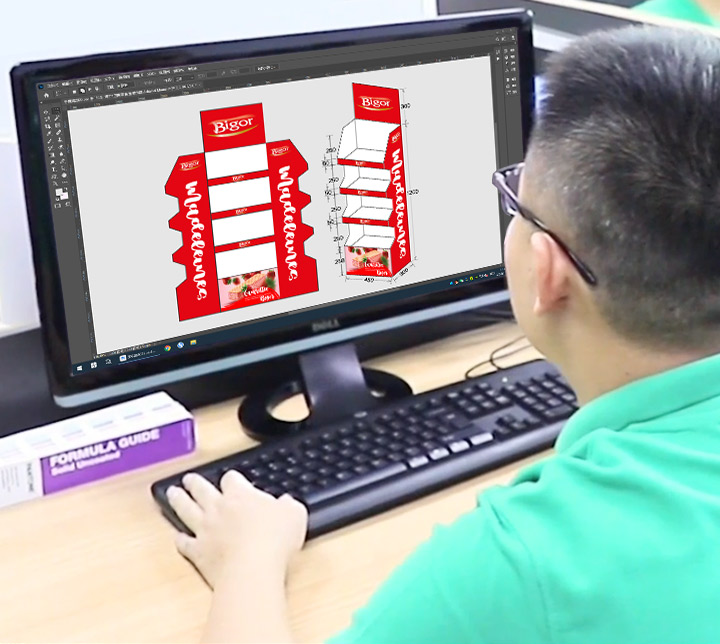
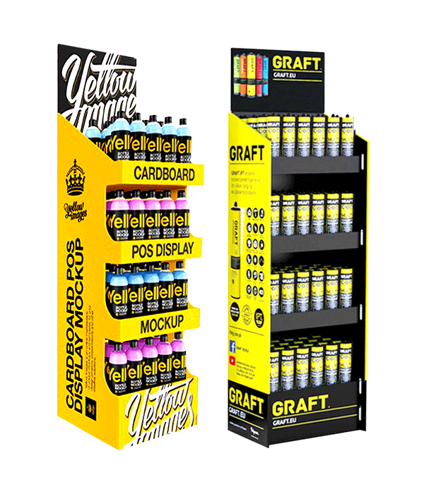
It can attract people’s attention the most, so the picture design is especially important in the design of the display rack.
Graphics can be divided into advertising graphics and product graphics.
Advertising graphics: refers to the graphics related to the advertising theme (characters, animals, plants, appliances, environment, etc.).
Product graphics: refers to the appearance and style in order to reproduce the goods, so that the audience can clearly see its appearance and internal functional characteristics and the need to promote and introduce the commodity graphics.
Therefore, the graphic design should strive to be simple and eye-catching. Pictures should generally be placed in the visual center to effectively capture the consumer’s attention and guide them to further read the advertisement further read the advertisement copy, which in turn produces a purchase action.
Copy design
Copy design can reflect the authenticity and inspirational features of outdoor advertising panels. Advertisement copy has a very obvious position in the display stand, and good copy can play a role of finishing touch. Its design is completely different from the design of advertising copy in newscardboards, magazines and other media. People cannot have more time have more time to read. Therefore, cardboard display rack copywriters strive to be concise and powerful. Generally, they remind the audience with a single eye-catching sentence, followed by a few short and powerful accompanying sentences. The theme language is usually designed to be no more than ten words. We should be concise and comprehensive, treat ten words as gold, cherish words, think over and over again, easy to read, easy to remember, humorous and interesting, making it infectious and dynamic.
Match with video
Video presentation, the need to combine pictures and text combined with audio output, with a certain video content output angle, combined with the advantages of the product, more introductory and interactive, the user can freely choose to understand the content part, not passive information transfer, greatly improving the user experience, video touch screen presentation, plastic is stronger, according to the use of the data can be quickly iterative information, you can do a better job of collecting information for the promotion of future Play a certain amount of data.
In short, an excellent cardboard display rack, not just a shelf, but has the role of attracting customers, promote consumption, and the necessary charts, text as the core, such as conditions can also be associated with the relevant video introduction, so as to enhance the sense of user experience. Of course, there is a point that we can easily ignore, people, if you have a good salesman, at the right time, it is possible to enhance sales to a greater extent.
Trusted by These Featured Clients


