The importance of colour matching of cardboard display racks and the principle of colour matching
By Shenzhen Topwon Group Co.,Ltd
Aug 17, 2024
The importance of colour matching of cardboard display racks and the principle of colour matching
Most people in shopping malls, exhibition halls, exhibitions, shops, shops and other excursion commodities When it comes to take the scanning way, with the eyes to complete the entire shop merchandise sweeping through, when found Mo a commodity they like and need, think there is a role of the product, before they will stay down to carry out a careful and slow observation.
Consumers in the view of the product is very easy to occur eye fatigue and dazzling.
Thinking about the design
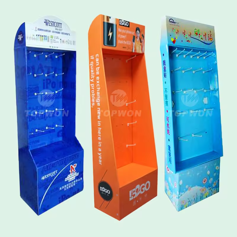
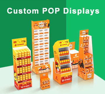
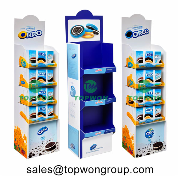
Custom promotional cardboard display racks, in addition to the structure, the surface colour matching is also very important, as, shop decoration is as important. So that according to this habit of consumers we must be careful when choosing the boutique is very simple, the structure and style of the display rack must be clear to show the effect should be good, convenient for consumers to touch the goods with their hands, and then through the waiter to introduce the product in detail.
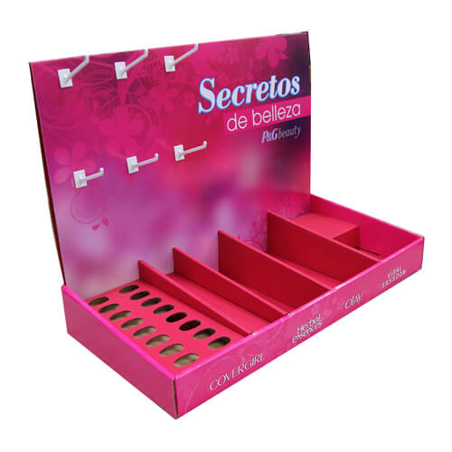
Consumers will pay attention to the colour and appearance of the goods in the purchase decision. Therefore, when designing cardboard displays, choose colours that complement the products as much as possible.
The meanings behind the colours
Yellow: Youthful and optimistic. Used to attract attention. Usually not used as the main colour of the entire car boutique cardboard display case, yellow frames should be matched with other colours.
Red: energy. Loft racks can bring a sense of urgency and accelerate the heartbeat. The top and bottom of the shelves in red can be used to attract impulsive shoppers.
Blue: a feeling of trust and security. This is why many motorways are signposted in white on a blue background. Deep navy blue and dark blue can be used to appeal to budget-conscious shoppers.
Some principles of colour matching
Same colour scheme
The same colour scheme refers to the use of the same hue of colours to match the form of colour matching, which is mainly manifested in the changes in the brightness and purity of a single hue. The overall visual effect of the same colour scheme is weak, and the individuality of the colour scheme becomes very strong, which is especially suitable for the expression of unique, private and individual theme images, such as the unique and magical micro-scene image expressed by the photo of the same colour scheme in red. Colour combinations in the same colour family within 15° of each other on the colour ring are the same colour scheme.
Proximity Colour Matching
Proximity colour matching is a way of matching colours with similar hues. The colour combination is the same as the colour combination in the same colour family within 15° of the same colour. The overall visual sense of the proximity of colour matching is weak, the overall tone is very coordinated, the picture can be directly expressed warm and cold and other colour characteristics, suitable for the performance of the same type of auxiliary, resonance, echo, harmony of the theme. Colour combinations within 45° of each other on the colour ring are proximity colours.
Contrasting Colours
Contrast colour matching refers to the way of colour matching by using hues with strong colour conflict, such as red and yellow-green, red and blue-green matching, which is characterized by strong colour contrast and strong sense of colour, and is more distinctive and fuller than the adjacent colour contrasts, which can easily bring a sense of excitement and excitement, and is suitable for the expression of random, secondary and jumping themes. Colour combinations within 120° of each other on the colour ring are contrasting colours.
Complementary Colour Matching
Complementary colour matching makes use of two completely opposite hues for colour matching. Complementary colours have the strongest hue contrasts and are richer and more sensually stimulating than contrasting colours. When two complementary colours are juxtaposed, they are in the strongest state of contrast, and when they are mixed they completely cancel each other out and reconcile into no colour at all. Complementary colour matching is suitable for the expression of open, opposing, strong and accurate themes.
In short, colour matching is an esoteric study, is the need for long-term study of the theory and practice of the combination of disciplines, through years of accumulation in the cardboard display rack industry, topwon has a very good understanding of the needs of customers, know how the colour should be matched with more in line with the aesthetic principles, more likely to impress end-users.
Previous Article
Toy collection display ideas for family and toy store
Next Article
Components of cardboard displays
Trusted by These Featured Clients